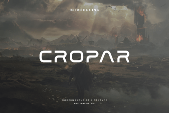
Cropar: A Display Font That Elevates Digital Branding
It started with a hero section that felt just a little too safe. I was redesigning a boutique online store for a ceramicist—minimal, tactile, quietly confident—and the current headline font looked like it had been pulled from a generic web-safe stack. Too neutral. Too forgettable. So I opened my font library and typed “Cropar.” The moment it rendered in Figma, something clicked: clean angularity, subtle rhythm, and that rare balance of modern and timeless.
Cropar is a display font—not meant for paragraphs or long-form reading, but built for impact. Its smooth, geometric angles give it structure without stiffness; its open counters and generous x-height make it legible even at smaller sizes on screen. It’s not flashy, but it’s intentional. You notice it, then you trust it. That’s the quiet power of a well-chosen display typeface.
I dropped Cropar into three key spots: the main headline (“Hand-Thrown Ceramics, Made to Last”), the subheading under the hero image (“Each piece shaped in Portland, shipped worldwide”), and the “Shop Now” button. On desktop, it held space beautifully—neither shouting nor whispering. On mobile, I tested it at 32px with 1.2 line height and light tracking. Still crisp. Still elegant. No blurring, no rendering hiccups—even on mid-tier Android devices. That reliability matters when every pixel contributes to perceived professionalism.
What makes Cropar especially useful for digital creators is how it behaves across contexts. On a light background? Crisp and airy. Over a softly blurred product photo? It anchors without competing. Against charcoal or deep navy? The contrast sings, and the angular forms gain subtle weight. I avoided using it over busy textures or low-contrast gradients—it’s refined, not rugged—and found it shined brightest where clarity and intention were priorities: landing page headers, course title cards, portfolio project labels, and branded email banners.
But here’s what I learned after testing it across five layout variations: Cropar isn’t a one-size-fits-all solution. It thrives as a hero title, a section divider, or logo lockup text—but not as body copy, navigation labels, or form placeholders. Its personality is too distinct for functional UI elements. And while it handles short phrases effortlessly (“Your Next Chapter Starts Here”, “Limited Edition Drop”), longer headlines start to lose breath. Less is more. Always.
For pairing, I landed on Inter—clean, highly readable, and freely available via Google Fonts. Cropar’s measured geometry plays well with Inter’s humanist sans serif warmth. Together, they create visual hierarchy without tension: Cropar sets the tone, Inter carries the conversation. For a more editorial feel—say, on a coaching site’s blog or newsletter—I swapped in a restrained serif like Literata. The contrast worked because both fonts share proportion and restraint. Avoid pairing Cropar with other geometric displays (think Montserrat or Poppins) or script fonts—they clash in energy and intent.
Before committing to Cropar in production, I checked the essentials: webfont availability (WOFF2 included), file size (under 40KB for the regular weight), and licensing clarity. It’s a commercial font, so I confirmed usage rights covered client websites, Shopify themes, and downloadable brand kits. No surprises. No hidden fees. Also worth noting: Cropar includes standard Latin characters, basic punctuation, and OpenType features like ligatures—but no extended Cyrillic or Vietnamese support. If your audience spans multilingual markets, verify coverage early.
Readability on mobile wasn’t automatic—it needed small tweaks. I increased letter-spacing by 2% on headings below 48px, added subtle text-shadow on dark image overlays (1px black at 20% opacity), and always tested against real device screenshots—not just browser emulators. Cropar doesn’t need heavy-handed fixes, but it does reward thoughtful implementation. That’s the difference between a font that looks good in isolation and one that works *with* your layout, not against it.
In practice, Cropar strengthened consistency across touchpoints. The same font appeared in the website header, Instagram story highlights, and the PDF brand guidelines I delivered to the client. That cohesion made the brand feel more considered—less like a collection of assets, more like a living identity. Users didn’t comment on the typography directly, but they did say things like “the site feels calm but confident” and “I immediately understood what this is about.” That’s typography doing its job: silent, strategic, and deeply human.
It’s also helped me rethink how I approach display fonts in general. Too often, designers reach for the most ornate or trendy option—only to realize later it undermines scannability or slows load time. Cropar reminded me that elegance lives in simplicity: in balanced spacing, predictable curves, and shapes that render cleanly across devices. It’s not “safe.” It’s smart.
If you’re building a portfolio site, launching a course, refining a SaaS landing page, or refreshing a small business brand kit, ask yourself: Does this headline need to be remembered—or just read? Does it represent a voice, not just information? If yes, Cropar deserves a spot in your test stack. Not as decoration, but as deliberate design language.
And one last note: preview it in context before finalizing. Try it over your actual hero image. Paste it into your live CMS preview. Check it next to your primary CTA color. Because the best display fonts don’t just look right—they feel inevitable.