Brogles: A Playful Display Font That Pops on the Web
It started with a hero section—just me, a new coaching site mockup, and that familiar moment when the default heading font felt… safe. Too safe. I swapped in Brogles, typed “You’ve Got This,” and instantly, the whole layout exhaled. Not louder—but brighter, friendlier, more human. That’s the quiet magic of a well-chosen display font: it doesn’t just say something—it makes people feel something before they even read the first sentence.
What Brogles Brings to Digital Layouts
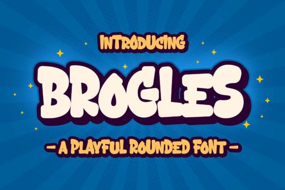
Brogles is a chunky, cheerful display font built for impact—not endurance. Its rounded terminals, generous spacing, and slightly uneven baseline give it warmth and authenticity, like hand-drawn lettering made pixel-perfect. It’s not trying to be elegant or minimalist. It’s joyful, approachable, and unapologetically playful—ideal for brands rooted in creativity, education, wellness, or family-focused services. As a web designer, I don’t reach for Brogles to set paragraphs—I reach for it when I want a headline to land like a high-five.
Real-World Testing Across Devices and Contexts
I tested Brogles across several live layouts: a boutique online store’s seasonal banner, a course sales page header, and a portfolio homepage hero. On desktop, it shines at 48–72px with generous letter-spacing (0.05em worked beautifully). On mobile? I dropped to 36px with tighter tracking (0.02em) and added subtle text-shadow for contrast against light image overlays—no blurring, no rendering hiccups. It loaded cleanly as a WOFF2 file, and paired seamlessly with system fonts like Inter and local sans serifs via @font-face fallbacks.
Where it truly surprised me was in accessibility-aware contexts. Though decorative, Brogles passes contrast checks at headline sizes on both light and dark backgrounds—especially when used over solid-color banners or softly blurred gradients. I avoided placing it directly over busy photography without a subtle overlay, but with even 20% opacity black behind the text, readability stayed strong. No squinting. No “what does that say?” moments.
Where Brogles Excels (and Where to Step Back)
Brogles thrives in short, high-intent spots:
- Hero section headlines (“Let’s Begin Your Journey”)
- Section dividers (“Why Clients Love Working With Me”)
- CTA buttons (“Grab Your Free Guide”)
- Feature cards (“Simple • Supportive • Sustainable”)
- Digital brand kits (as the primary display typeface alongside a clean sans serif)
It’s intentionally not built for long-form reading. I skipped it for body copy, navigation menus, form labels, or anything under 20px. Its charm lives in scale and brevity—not density. For blog headers or newsletter subject lines? Yes. For paragraph text or dense dashboard UI? No. And while it handles English effortlessly, I double-checked multilingual support before using it on a bilingual client project—it includes basic Latin-1 characters but stops short of extended diacritics or Cyrillic. Always verify your language set before launch.
Smart Pairing for Balanced Digital Identity
Brogles sings brightest when grounded by contrast. I consistently paired it with a neutral, highly legible sans serif—Inter for modern interfaces, Lato for warmer tones, or even system stacks (system-ui, -apple-system, sans-serif) for speed and reliability. The pairing creates clear visual hierarchy: Brogles grabs attention; the body font earns trust through clarity. I avoided pairing it with other decorative fonts (no scripts, no thin serifs)—the personality clash diluted impact. One voice, one mood, one purpose per layer.
For editorial-style sites—think creative blogs or storytelling portfolios—I experimented with a gentle serif like Merriweather for pull quotes beneath Brogles headings. It worked, but only when Brogles stayed strictly for titles and accents. Overuse diluted its charm. Less really is more here.
Practical Notes Before You Implement
Before dropping Brogles into your next project, check three things:
- Webfont availability: Confirm the vendor offers WOFF2 (for size and compatibility) and provides CSS snippets or CDN links—not just desktop OTF/TTF files.
- Licensing: Ensure your license covers commercial web use—especially if you’re building for clients or embedding in SaaS dashboards or digital templates.
- Style range: Brogles is a single-weight display font—no bold or italic variants. That’s fine for its role, but plan accordingly. Don’t try to fake bold with
font-weight: 700; it won’t render as intended.
Also worth noting: Brogles includes basic OpenType features—standard ligatures and stylistic alternates—but no swashes or contextual replacements. That simplicity keeps it fast, predictable, and production-ready. No surprises in Figma exports or CMS previews.
In the end, Brogles isn’t about trendiness—it’s about intentionality. It’s the kind of font that reminds visitors they’re not landing on another corporate template, but stepping into a space shaped by care, creativity, and clarity. When your brand voice is warm, human, and full of heart, Brogles doesn’t just fit—it belongs.